Ranking Relevance
Here’s a data visualization I worked on with New America’s International Security program. The main idea is to show how the National Research Council’s rankings of university political science programs are hopelessly inadequate.
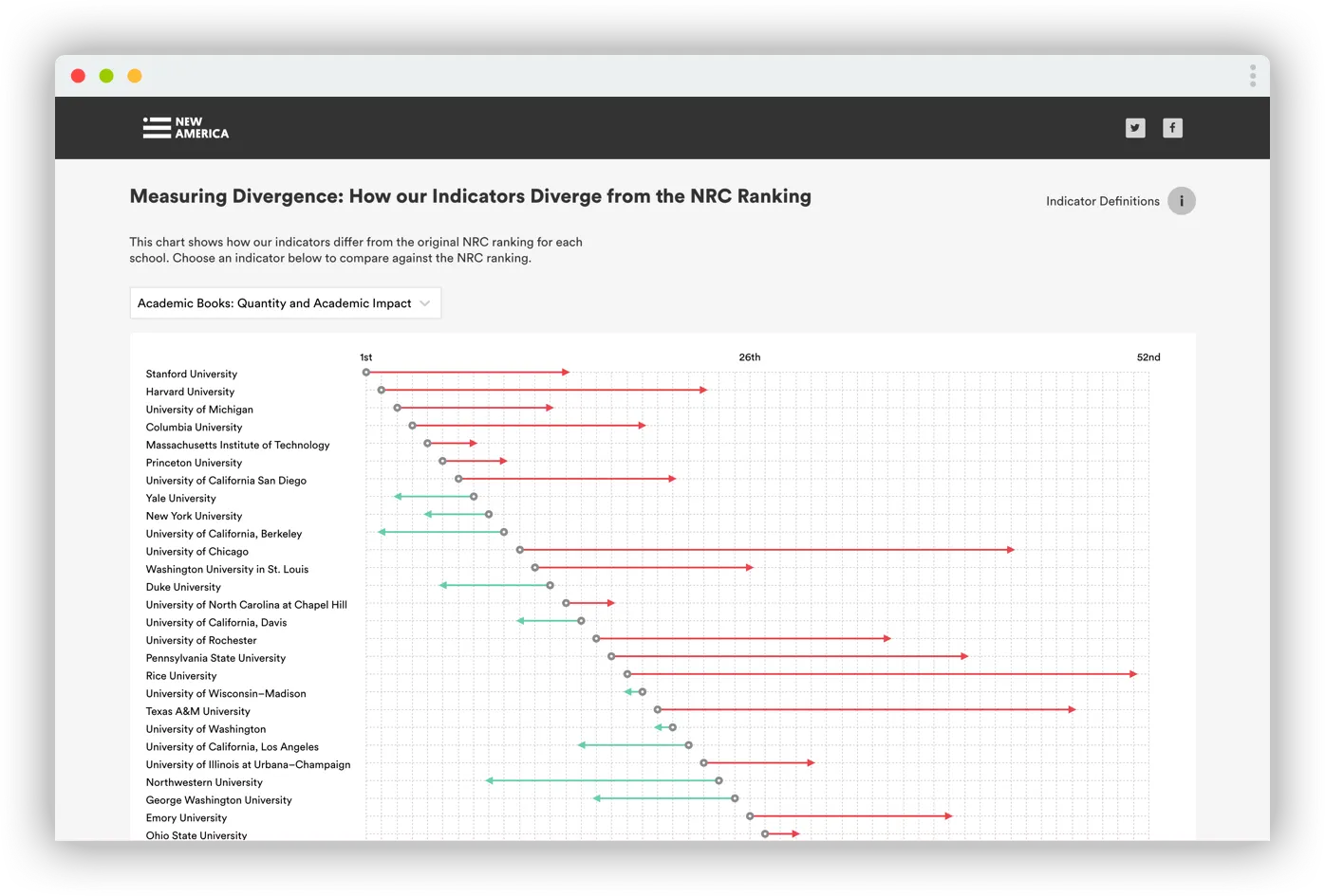
We worked with two professors who collected data on a bunch of different indicators for 52 universities. The NRC rankings focused mostly on myopic academic indicators like citations in peer-reviewed journals. Our indicators, in contrast, looked at a variety of “policy” and “real world” metrics, in addition to the academic metrics. There’s a couple charts here, but I’m mostly proud of the arrow plot:

My first inclination was to do a scatterplot, with “academic” indicators on one axis and “real world” indicators on the other axis. I prototyped this in an Observable notebook, and it was horrible! It took me a couple iterations to land on the arrow plot.
One thing that helped was realizing that the professors weren’t interested in comparing academic metrics to real world metrics—they wanted to deal a final death knell to the NRC’s tarnished gold standard. I think the arrow plot does a good job of showing how one-sided the NRC ranking can be.
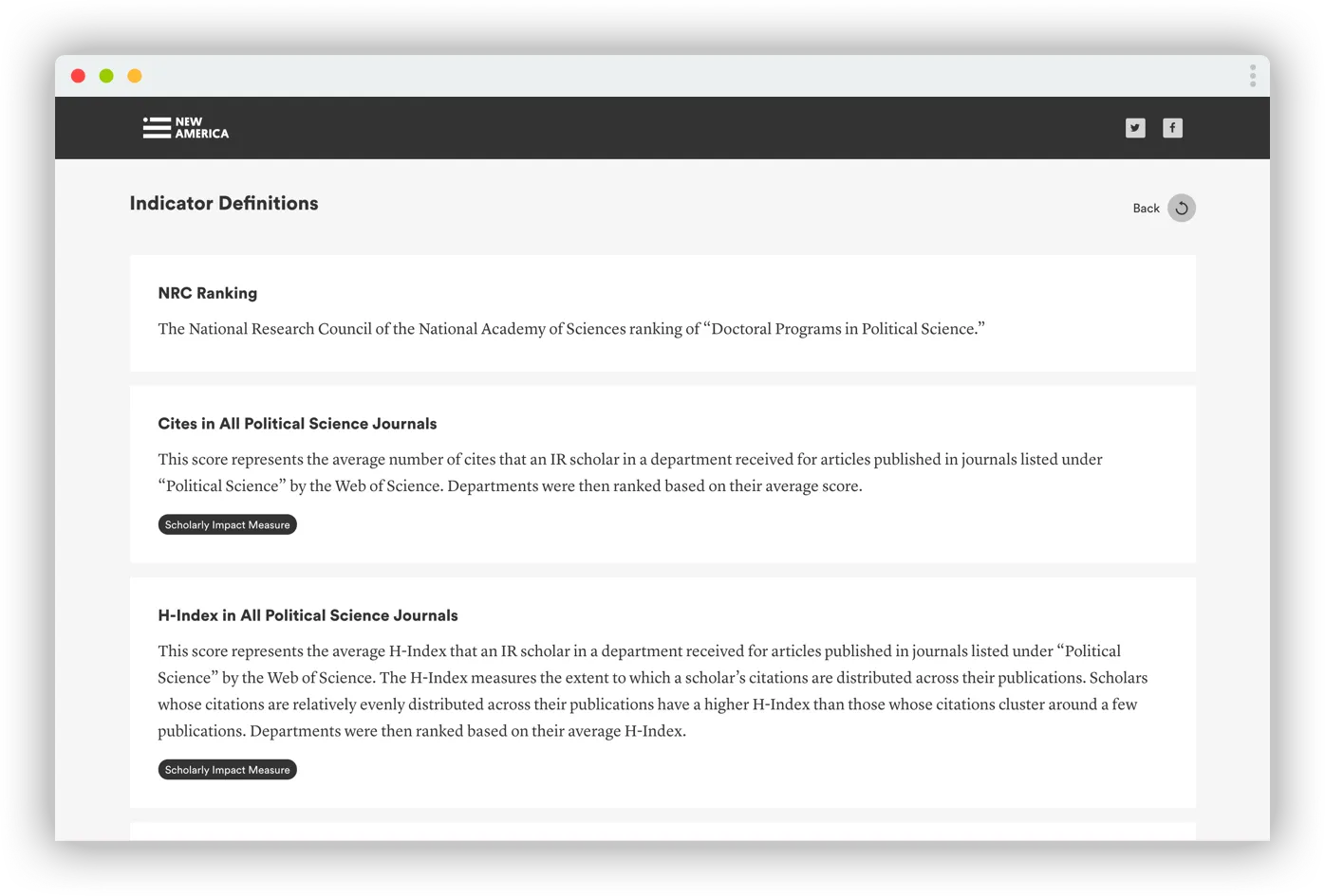
Still, our indicators were verbose and hard to understand. To help audience understanding, we developed another view in the chart with simplified versions of the indicator definitions:
