So You Want to Build a Graphics Team at Your Think Tank…
I want to preface this by saying that I deeply respect my colleagues, and I think the challenges I lay out here are opportunities in disguise—for me, my organization, and our industry (that is, the very small world of non-profit think tank graphic teams).
People create data visualizations for a lot of reasons. Here’s a map of the data visualization community that Elijah Meeks recently showed at a prominent data visualization conference:
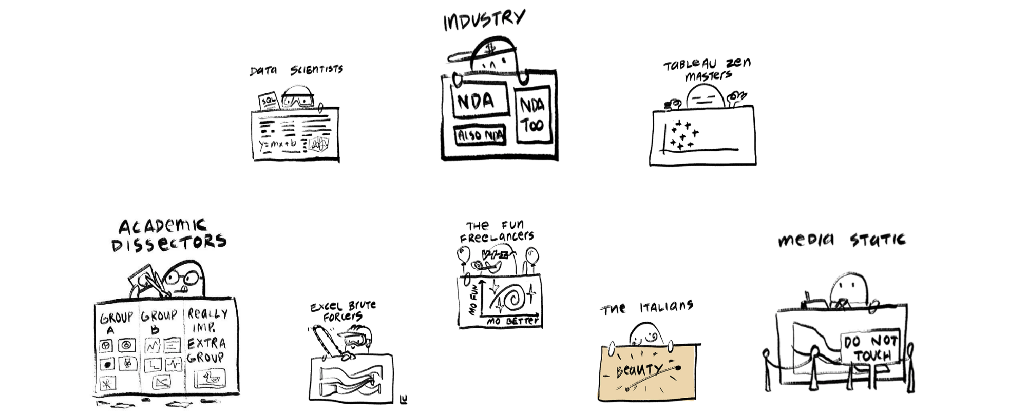
You’ll notice industry, who use data visualization to inform business decision making. Fun freelancers and the Italians, who are bending the lines between data visualization and art. Academics, who, well… who knows what they do. The media, the 800lb gorilla in the room, who create (often static) data visualizations to improve the clarity and quality of their journalism.
But what about data visualization in the context of politics and policy? A lot of news organizations create visualizations about policy, but their goals are different from ours. For news organizations, it comes down to explaining the ideas they report on in clear and concise ways. For think tanks, we communicate our ideas with the express intention of changing policy and shaping the public debate around particular issues.
Most major news organizations have incredible graphics departments whose work shapes the field of data visualization and has arguably changed the way stories are told in the 21st century. I’m looking at the New York Times, ProPublica, the Guardian, the Financial Times, NPR, Politico, Bloomberg, and many others. There are trade groups and organizations centered exclusively around the production of graphics in the newsroom and the use of data to inform and drive journalism, like NICAR and the Source. There are upstart publications like the Pudding, who focus on data-driven storytelling through innovative visual design. It’s a flourishing community, and the proliferation of open source tools that foster collaboration across different organizations is wonderful and inspiring to see. Graphics, data, and technology are integral parts of modern journalism’s DNA, as they rightfully should be.
The picture is bleaker in the world of policy, think tanks and non-profits. There aren’t many organizations out there with full fledged graphics operations. The notable ones are CSIS, Urban, WRI, CAP, maybe Brookings, and the place where I work, New America. The sad reality is that we don’t influence the field of data-visualization (maybe with the exception of Jon Schwabish at Urban), we don’t drive new forms of storytelling, we don’t release tooling and processes that make it easier for other groups to learn from and build off of our work, and saddest of all, we don’t get invited to speak at conferences 😢 (also with the exception of Jon Schwabish, lol). We’re constantly trying to catch up to the examples set by our friends who tell the news, and to be quite honest, we’re years behind.
Why haven’t we been able to create good graphics?
Graphics, data, and technology should be just as important to the modern, well-funded think tank as they are to the modern news organization. Think tanks operate in a marketplace of ideas. We sell our ideas through a combination of brand strength, a carefully constructed cult of “The Expert,” and the two things I’m interested in—evidence and data. In my field, we take it as an almost foundational belief that in the right circumstances, an intelligently designed graphic can illuminate the evidence and data behind an idea more effectively and efficiently than a 10,000 word report.
So what prevents us from creating graphics that effectively sell our ideas and are at least as good as what our friends in the news business are making?
Problem 1: Resources
To me, a lack of resources is the most obvious and the least interesting answer to this question. At New America, we have 3 people who spend at least part of their time doing data visualization work. CSIS and Urban have a few more than us, and other organizations are at similar staffing levels. In contrast, the New York Times has dozens of designers, developers, and data visualizers. They even employed Mike Bostock at one point, who is arguably the most influential person in the field of data visualization today.
But the resource problem shouldn’t stop us from doing our best work, it just means we won’t be able to produce as much of it. As long as the 3 people on your graphics team are good at what they do, at least in theory, they should be able to create a data visualization that is just as good as something that has come out of a major news organization.
Another way I like to look at it is that we’re not just 3 people, because the things we create build upon technologies that are made by hundreds of the most talented developers and data visualization professionals you could ask for. For instance, New America’s data visualization component library is built on a project called vx (supported by AirBnb) which in turn uses something called D3 (created by Mike Bostock) and a framework called React (released by Facebook). We use several open source tools from the New York Times that greatly improve our workflow. We stand on the shoulders of the same giants as every single newsroom graphics department.
And as my friend and former colleague Andrew Lomax put it—in the non-profit world, we’re experts in the art of doing a lot with very little.
Problem 2: The data viz process meets the grant cycle
In an ideal data visualization process, there are several important phases that must be undertaken to produce a good graphic:
- Idea generation
- Start with an idea for a story.
- Data collection
- Collect data that’s related to your idea.
- Data analysis
- Analyze that data to find interesting trends, strange outliers, and descriptive statistics. Does the analysis of the data support the idea? If not, you might need to start over with a new idea, look for different data, or analyze the data in a different way.
- Ideation
- Dream up all of the different ways you can encode categories of data onto graphical channels (color, size, position, etc). Are there other multimedia elements that could be integrated into the story (perhaps photos, video, audio, etc.)?
- Prototyping and exploration
- Try out all of these wacky ideas with low-fidelity prototypes, using the actual data you have collected. Explore any new ideas that may come to you during this phase.
- Testing
- Test these prototypes with a couple people who will actually be reading the story (Finding real audience members is hard, but colleagues from different programs, who aren’t as deeply familiar with the subject matter as you, are generally willing to help out). What do they take away from your prototypes?
- Editorial decision making
- It’s time to decide what will be included in the published result, using information gathered during the prototyping, exploration, and testing phases. How are we going to frame the graphics we’ve chosen? Do we want to draw audience attention to particular data points with an annotation layer? Side note: Amanda Knox, the graphics editor of the Upshot at the NYT, once famously said, “The annotation layer is the most important thing we do.” For an excellent overview of how editorial thinking can shape a graphic, I highly recommend this 15 minute talk from Tapestry Conference, a major industry gathering.
- Visual design
- Apply color, spacing, and typographic choices to your graphics. Make sure your graphic coheres with any brand guidelines your organization may have.
- Development
- Code that shit up.
If you find your initial ideas don’t work by stages 5, 6 or 7, you might need to go back and revisit stages 1, 2, and 3. The process should be iterative by nature.
Instead, our work flow looks something like this—a program submits a grant proposal to a philanthropic foundation to work on a particular issue. This proposal will usually include several “deliverables,” things that the program has to produce and events they have to organize to fulfill the scope of the grant. Included in these deliverables will be at least one report, which (for our purposes), includes something like 3-6 data visualizations.
If they receive the grant, the program will research the issue they’ve promised their funder to work on. They’ll collect their data, analyze it, form their conclusions about it, and write about it.
Once their data is collected and analyzed, their idea formalized, the writing at least partially started, they will come to the communications department and say, “Hey, we’re going to release this report in 1-3 months, let’s talk about producing graphics for it and putting it through our editing, review, and publishing process.” If we’re lucky, the program will come to us with their dataset and maybe a couple key takeaways and ask for our help coming up with interesting visual forms for their ideas. If we’re unlucky, they’ll have a preconceived idea of what they want and ask us to build it for them within a certain amount of time.
In this context, we’re left little to no room for the exploratory and iterative phases of a successful design process. If an idea doesn’t pan out, or if a mediocre visualization does not faithfully represent the author’s work, it’s almost impossible to put the brakes on the process, take a step back, and reevaluate if we’re using the right dataset or reanalyze the existing data. If a program has promised their funder that they will publish their report in September with 3-6 data visualizations, they’re under immense pressure to do so regardless of whether or not the visualizations accomplish their goals.
The way the research and publication process is set up at most think tanks chops off 3 to 4 of the most important phases of the data visualization process. It removes these phases from the hands of the data and design experts and either omits them entirely, or puts them in the hands of policy experts, people who may have very little experience with data and/or design.
To be clear, nothing is ever published with ill-intent. Nothing that we know to be incorrect will ever make it into a publication, regardless of any pressure an author may be under to release their work into the world. What does happen is that we produce graphics that do not effectively communicate the core message of our work. And at the end of the day, the ineffectiveness of a graphic will dilute the strength of an argument that might otherwise be perfectly sound.
Problem 3: The separation between communications and program
We’ve now split what is supposed to be a unified process into two disparate processes, with crucial phases left out entirely:
Program responsibility
- Data collection
- Data analysis
- After the data is compiled, the extent to which data is analyzed / explored varies greatly from program to program and analyst to analyst. Often times, there will be little to no analysis of the dataset to inform graphical ideation/decision making.
- Ideation and exploration
- Around 60-70% of the time, programs will come to us with preconceived ideas about how they want their graphics to look, without testing those ideas with real data.
Omitted entirely
Prototyping and explorationTestingEditorial decision making
Graphics team responsibility
- Visual design
- Development
It wouldn’t be a problem if these phases of the data viz process were undertaken by different people from the same team. But in most think tanks, the communications department is siloed from its various programs. And the unfortunate reality is that we’re bad at talking to each other.
At New America, programs pay 6% of their yearly budget to “Central”—the fundraising, events, operations, editorial, and yes, design/data visualization teams. Programs expect something for their 6%, and we have to deliver. So our graphics team is not only siloed from the programs we need to deeply collaborate with, we also play the role of an internal “client service” agency that fulfills design and data viz needs. Our ability to prototype and experiment with different kinds of visualizations, in my opinion the most important part of the design process, is now entirely at the discretion of the client. And the client is always right.
Some examples
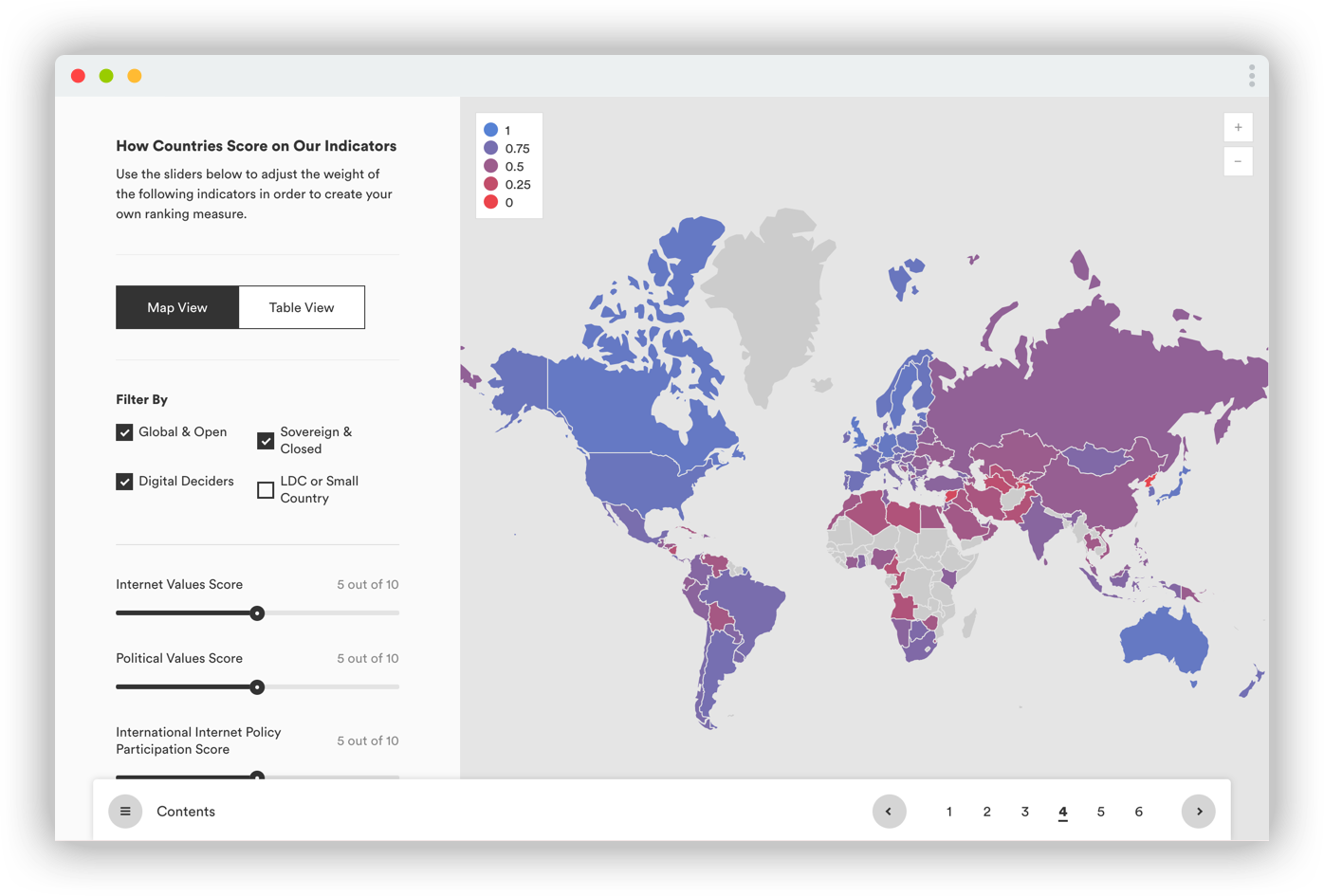
Example 1: Digital Deciders
We intended for this to be an “exploratory” data visualization. It’s biggest flaw is that there’s nothing to explore.
The author, after collecting his data, came to us with an idea for exactly what he wanted out of this graphic—an interactive map/dashboard with scrubbable sliders that change the weights of certain indicators and output a single ranking and weighted score for each country on the map. The weighted score barely changes when weights are applied to the indicators, resulting in almost no changes to the map’s color scale. But the author knew what he wanted, and we executed.
Even though it’s visually appealing, the graphic tells the viewer very little about the underlying data, and the dashboard-y aspects of being able to change the weights applied to different indicators are a distraction, at best.
Graphics team responsibilities:
- Visual Design
- Development
Example 2: Ranking Relevance
Here’s a slightly better example. The authors came to us with a dataset of university political science departments ranked across a number of indicators. They had the concept and the data, but they didn’t have a clear idea of what they wanted for the visualizations. There was also no firm publishing deadline, leaving us with enough room to go through an ideation, prototyping, and experimentation stage.
My first idea was an interactive scatterplot with “academic” indicators on one side, and “real world” policy indicators on the other side. I prototyped this with the actual data, and we realized that it accomplished absolutely nothing. The beauty of a prototyping and experimentation phase is that no ideas are bad enough not to try. Each failure leads to something that’s at least slightly better. Eventually we landed on an interactive arrow plot, which shows how different indicators fare against university rankings released by the National Research Council (NRC), considered a gold standard in academia. The arrow plot communicates pretty clearly that the NRC rankings are bullshit if you take into account other things like books, media citations, and congressional testimony.
If we had stopped at the scatterplot, the visualizations in this report would have failed. The only reason they’re marginally successful is that we were able to prototype and explore different graphics with real data.
Graphics team responsibilities:
- Ideation
- Prototyping and experimentation
- Visual Design
- Development
The implications of our failures
The obvious implication of our failure to go through a full data visualization process is that we end up producing graphics that do not facilitate audience understanding. We end up creating graphics that do not intuitively show people what we want them to understand from our sexy new ideas. In other words, we’ve put pretty marks on a webpage but at the end of the day, they are fundamentally useless. They have created no value for the readers who have invested their time in trying to understand our custom, branded, interactive charts.
The more insidious and dangerous implication is that we destroy reader trust in our work. Losing the trust of your average reader is bad, but what happens if that reader is a well positioned congressional staffer, who no longer trusts the information graphics of our organization? Could that distrust extend to the idea itself? To the organization as a whole? If the answer is yes, even in just one case, for one person, we’re working against the mission of our organization.
And what if we destroy a reader’s trust in the type of representation we chose for the data? What happens if we show someone a scrubbable map that fundamentally does not work, and they lose their trust in all similar scrubbable maps, even ones that our friends are creating for different issues, in different organizations? What if we have actually decreased the visual literacy of our audience?
At this point you have to ask, why did we create a graphics team in the first place? And that would be a perfectly valid question.
A call to arms
Maybe I’m just a shit developer and designer who can’t work creatively under organizational constraints. But then I look at other think tanks that produce graphic content and I see mediocrity there too. Part of the problem could be me, but it could also be the systems we’re part of. What I do know is that I’m not happy with the work I’ve been doing, and I want to make it better.
If we want to earn a place in the community of people driving new forms of visual storytelling, we need to step up our game. We need to find ways of organizing our teams and workflows that allow a full fledged data visualization process. We need to hire the right people for the right jobs, and enable them to do their best work. We need to change the systems that get in our way.
I don’t have the answers, but I do have a couple of ideas:
-
Create technical and design systems that reduce the amount of design and development work we have to do on day-to-day projects, so we can focus more on the ideation, prototyping, and experimentation phases of projects we think have serious potential.
For instance, at New America, we’re creating a chart and components library that makes developing new projects and deploying them to production as easy as possible. We provide pre-made components for common chart types and user interface features like search boxes, dropdowns, toggles, and sliders. For projects that do require custom development, we provide a color system, a margin and spacing system, and a typography system. It’s pretty rad.
-
Embed graphics/data people into programs, so they become involved in the grant making process, and the idea generation, data collection, and analysis stages of a project. Free up their time to focus on prototyping and experimentation by making the visual design and development of a project as easy as possible. In other words, let your data visualization professionals use a tried and true data visualization process. Bring back stages 1-5. Ease the burden of 8 and 9.
There’s precedent for this in the news industry. Nadja Popovich, who creates amazing graphics about climate change for the New York Times, works on the climate desk, not in the graphics department.
-
Hire policy analysts who know how to design and code. Or train the policy analysts you do have on principles of data analysis and visual literacy. Jon Schwabish at Urban has done a lot of work around this.
-
Teach your graphics people about policy so they can drive their own projects. Or, at the very least, have your policy experts come to your graphics experts with an idea for a story, and nothing more. Start from there and work your way through the process together. Start at phase 1, and I promise you the end result will be better.