Undermining Pell
Last fall, New America’s Education Policy program came to us for help with one of their flagship publications—an annual analysis of public university affordability for lower-income students. They do this study each year, and consistently find that public universities are charging lower-income students higher and higher tuition costs.
The author had originally wanted to recreate a scatterplot our graphics team made last year. The scatterplot shows the percentage of low-income students receiving Pell grants on the Y axis and the school’s average net price on the X axis. The circles that represent each university are sized proportionally to that school’s endowment, and divided into four separate quadrants.
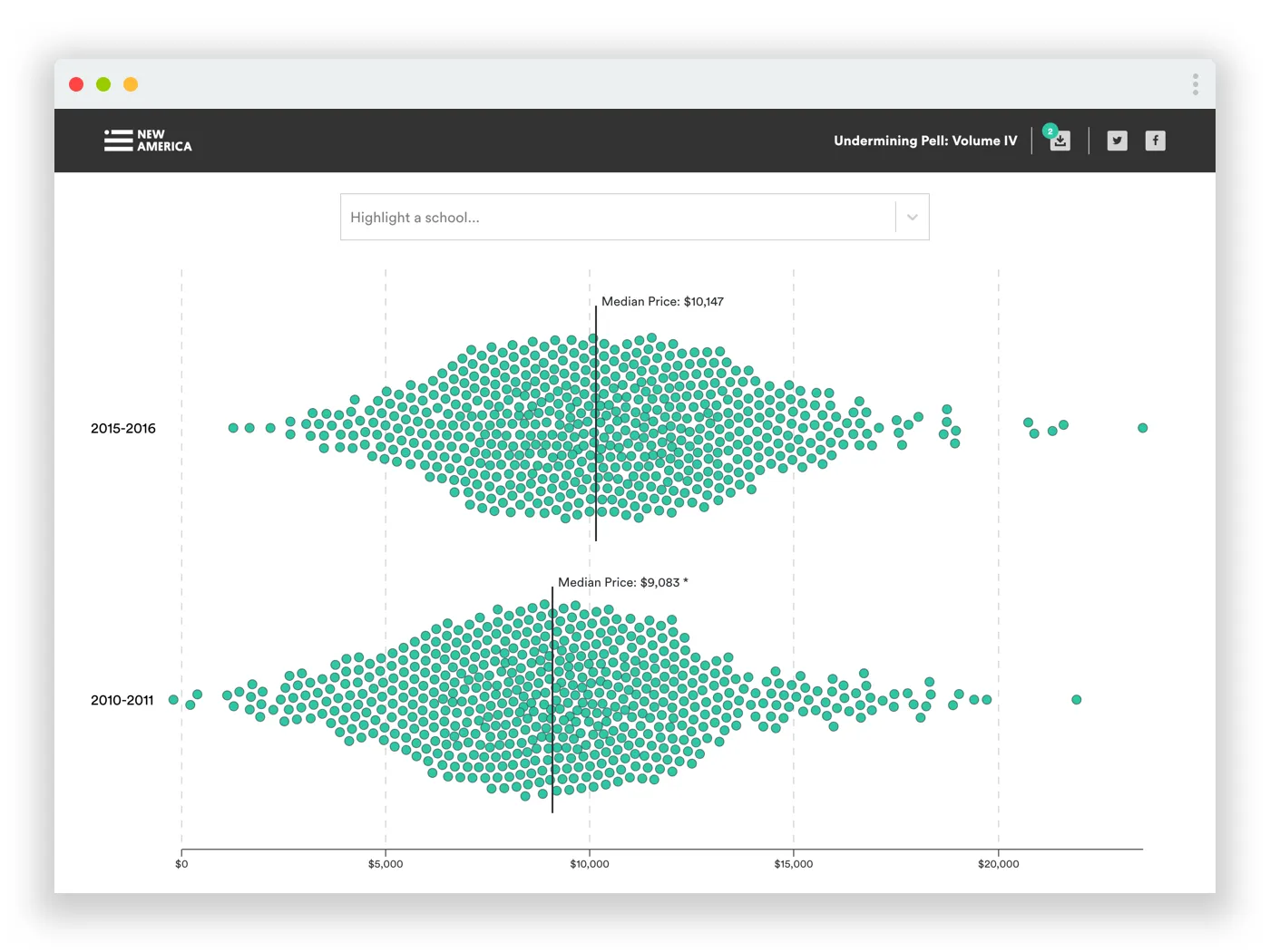
After reading the author’s findings and looking at the data, I realized the purpose of this year’s report was a bit different. It was the first year that over 50% of public universities were charging low-income students $10,000 or more, and I wanted to design a data visualization that could support that message. Recreating last year’s scatterplot was not going to do the trick.
Instead, I proposed an interactive beeswarm chart that could intuitively show how tuition prices for low-income students have gone up, while still showing the granular detail of the individual schools. I included some nifty hover states, as well as an auto-complete search box that lets people highlight the schools they’re interested in. I’m pretty happy with the result.